Projected maps
In this tutorial, we will guide you through how to reproduce the projected maps of a galaxy group and cluster, as featured in Fig. 2 of the entropy plateaus paper. These maps visually capture key physical properties of the simulated systems, such as:
Hot-to-cold gas mass ratio
Emission-weighted temperatures
Mass-weighted entropies
By the end of this walkthrough, you will be able to generate your own visualizations directly from the simulation data.
Overview of the data
The maps are built from high-resolution simulation outputs stored in HDF5 format. These files contain precomputed quantities for both the group and cluster simulations.
To locate the data, navigate to:
$ cd <root directory>/entropy-core-evolution/data/fig2_maps
You will find two key files:
$ ls
cluster_+1res_maps.hdf5 group_+8res_maps.hdf5
You can explore the contents using the h5dump command:
$ h5dump -n cluster_+1res_maps.hdf5
HDF5 "cluster_+1res_maps.hdf5" {
FILE_CONTENTS {
 group      /
 dataset    /center
 dataset    /entropies_mass_hightemp
 dataset    /entropies_mass_lowtemp
 dataset    /m500
 dataset    /masses_hightemp
 dataset    /masses_lowtemp
 dataset    /r500
 dataset    /redshift
 dataset    /roi
 dataset    /snapshot_index
 dataset    /temperature_mass_hightemp
 dataset    /temperature_mass_lowtemp
 }
}
These datasets cover various physical properties across different phases and temperature ranges.
Loading the data in memory
Let’s start by loading the contents of these HDF5 files into Python so we can work with them. We will create a utility function that reads the data into a convenient Python dictionary.
import h5py
import numpy as np

def load_hdf5_to_dict(filepath):

    data_dict = {}

    with h5py.File(filepath, 'r') as f:
        for key in f.keys():
            data = f[key][()]

            # Automatically convert to numpy array if needed
            if isinstance(data, np.ndarray):
                data_dict[key] = data
            else:
                data_dict[key] = np.array(data)

    return data_dict
Now, call this function to load the group and cluster data:
group_data = load_hdf5_to_dict("group_+8res_maps.hdf5")
cluster_data = load_hdf5_to_dict("cluster_+1res_maps.hdf5")
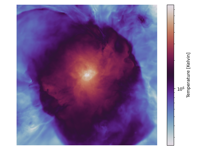
Example: mass-weighted temperature
As a concrete example, let’s visualize the mass-weighted temperature of the group at \(z=0\)
import matplotlib.pyplot as plt
from matplotlib.colors import LogNorm

phase_idx = -1
mass_weighted_temperatures = group_data["temperature_mass_hightemp"][phase_idx] # Units: K Msun
masses = group_data["masses_hightemp"][phase_idx] * 1e10 # Units: Msun (originally saved in SWIFT units)

plt.axis("off")
plt.imshow(mass_weighted_temperatures / masses, norm=LogNorm(), cmap='twilight')
plt.colorbar(label="Temperature [Kelvin]")
plt.tight_layout()
plt.savefig("map_group.png")
plt.close()
The resulting plot will look like this:
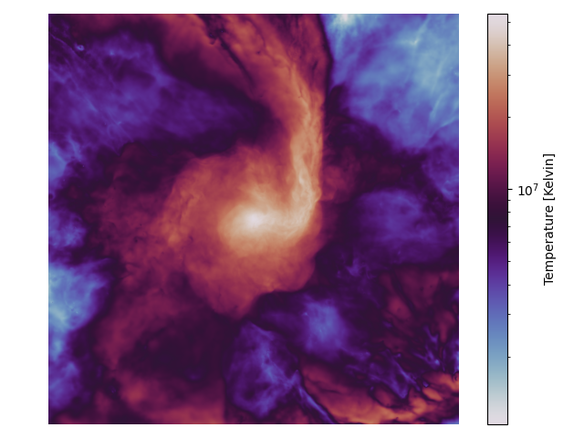
To generate the corresponding map for the cluster, follow the same procedure using the
cluster_data dictionary:
You can also find a script with the snippets above merged together in the test directory of
the GitHub repository.