Lagrangian histories
In this example, we work with data from cosmological hydrodynamic simulations of a galaxy group.
Each NumPy .npy file contains the time evolution of a Lagrangian quantity — such as radius,
entropy, temperature, or density — for gas particles that, at redshift zero, lie in one of three
radial regions:
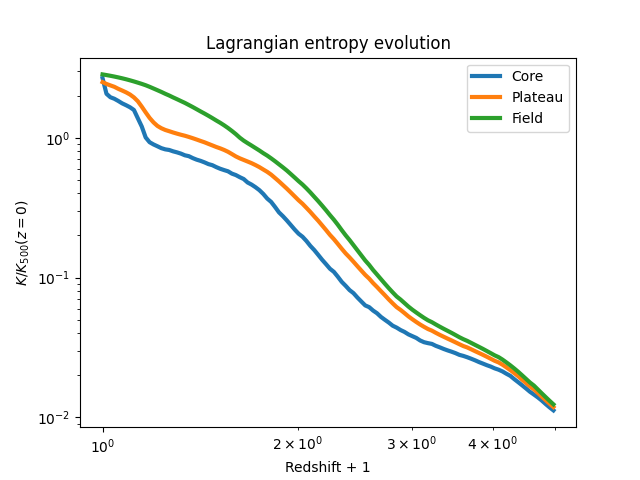
Core: the innermost \(<0.15~r_{500}\).
Shell: the shell between \((0.15-1.00)~r_{500}\), where the entropy plateau is observed.
Field: the region between \((1-6)~r_{500}\), out to the high-resolution boundary of the zoom-in simulation.
These histories are stored as NumPy .npy files, with each file containing the time evolution of
a specific quantity for particles in one region.
Additionally, a redshift.npy array provides the redshift at each simulation snapshot, and a
k500.npy file contains the entropy normalisation factor at \(z=0\).
Directory layout
Before we look at the code, make sure your project directory is organised like this:
data/
└── VR2915_+1res_ref/
    ├── redshift.npy
    ├── k500.npy
    ├── gas_history_radius_Rcore_Thot_Oref.npy
    ├── gas_history_radius_Rshell_Thot_Oref.npy
    ├── gas_history_radius_Rfield_Thot_Oref.npy
    ├── gas_history_entropy_Rcore_Thot_Oref.npy
    ├── gas_history_entropy_Rshell_Thot_Oref.npy
    ├── gas_history_entropy_Rfield_Thot_Oref.npy
    └── (other files)
Each history file ends with the \(z=0\) value, which we will use for normalisation.
The file name gas_history_radius_R{core}_T{hot}_O{ref}.npy contains the following information:
Rindicates the radial region, can be{core, shell, field}.Tindicates the temperature cut, can be{hot, cold}.Oindicates the sub-grid model used to select particles at \(z=0\), can be{ref, nr}.
In this example, we are already looking at a Ref-model simulation, and the ‘Origin’ (O) is
also Ref, meaning we are selecting gas particles in Ref and tracking in Ref (red solid curves in
the paper). If you want to select gas particles in NR and track them in Ref, you will need to go
in the Ref data directory, and look for gas_history*Onr.npy files.
For the rest of this tutorial, we will consider the Ref-selected gas tracked in Ref.
Loading data
We start by defining a helper function to load both the redshift array and any selected history
array. Note that an extra data point was accidentally appended to the data array, so we’ll
remove that.
import numpy as np

 # Base directory where all runs are stored
 runs_location = "../data"

 def get_data(filename: str, run: str) -> tuple[np.ndarray, np.ndarray]:
     simulation_directory = f"{runs_location}/{run}"
     redshift = np.load(f"{simulation_directory}/redshift.npy")
     data = np.load(f"{simulation_directory}/{filename}.npy")[:-1]
     return redshift, data
Preparing the entropy data
We’ll now load the entropy histories for the core, shell, and field regions and normalize them by the \(K_{500}(z=0)\) value.
# Define a convenient shortcut for loading entropy histories
get_data_group = lambda region: get_data(
    f"gas_history_entropy_R{region}_Thot_Oref",
    "VR2915_+1res_ref"
)

# Load entropy time series
redshift, core = get_data_group("core")
_, shell = get_data_group("shell")
_, field = get_data_group("field")

# Normalise by K500 at z = 0 (in keV cm^2)
k500 = np.load("../data/VR2915_+1res_ref/k500.npy")[-1]

core /= k500
shell /= k500
field /= k500

# Apply a redshift cutoff to focus on z < 4
z_mask = redshift < 4.0
redshift = redshift[z_mask]
core = core[z_mask]
shell = shell[z_mask]
field = field[z_mask]
Plotting the evolution
Finally, we plot the normalised entropy evolution for all three regions, using a log-log scale for clarity.
import matplotlib.pyplot as plt

 plt.figure()
 plt.loglog(redshift + 1, core, lw=3, label="Core")
 plt.loglog(redshift + 1, shell, lw=3, label="Plateau")
 plt.loglog(redshift + 1, field, lw=3, label="Field")
 plt.xlabel("Redshift + 1")
 plt.ylabel(r"$K / K_{500}(z=0)$")
 plt.legend()
 plt.title("Lagrangian Entropy Evolution")

 plt.savefig("lagrangian_histories.png")
This script will generate and save a figure named lagrangian_histories.png, showing how the
entropy evolves over time in the core, shell, and field of the galaxy group. The plot should look
like this:
You can also find a script with the snippets above merged together in the test directory of
the GitHub repository.